This article is the final in our series explaining the HPL Adaptive Software Review Standards. We have identified 26 criteria categorized into six domains for evaluating software. This review framework addresses the question, "How do students learn online?" This resource aims to offer educators a more profound understanding of the online learning process for students when utilizing online adaptive programs. Read our two articles in the series,
- “Oops to Aha! Putting the "Adaptive" in Adaptive Software.”
- Data-Informed Teaching: Reading the Stories Behind the Numbers
If you are already a member of the HPL Network, you can access the template for our software review standards by clicking here. If you still need to become a member, you can join for free by completing this form.
Furthermore, we have employed these standards to assess 25 commonly used adaptive software programs. To learn more about accessing these reviews or seeking guidance from our team about adaptive software, please refer to the HPL Adaptive Software Library page.

For better or for worse, I grew up watching Spongebob Squarepants. Every once in a while, something will trigger the memory of some silly, slapstick-humor scene from Spongebob. When I thought about how to start this blog post, I immediately remembered the F.U.N. song. For those unaware of what it was like to be half-raised by this yellow sponge of joy in the early 2000s, this short clip will give you deep insight into the childhood of a millennial.
This clip came to mind when thinking about educational software, but perhaps for the opposite reason you’re thinking. I don’t think software should be fun. Okay, let me be more precise: I don’t think that fun should be a goal of educational software. While we know game-based learning can lead to learning experiences rich in engagement and rigor, we have seen that when educators solely focus on fun, students lose out…or lose interest. If fun isn’t our goal, then what should be?
Software doesn't have to be “fun” in a traditional sense - what's more important is engagement. A telling example of the difference between engagement and fun is social media. While I wouldn’t consider scrolling through Instagram or Facebook particularly fun, I would surely say that it is engaging. These platforms hook us with seamless design, ease of use, and novel content that is personalized. Great adaptive software does the same, but rather than driving engagement through cat videos, it engages students through meaningful learning.
In the next section, I’ll explore the relationship between student engagement and the seamless user experience design of adaptive software. So, instead of aiming for fun, let’s aim to F.U.N. - Facilitate User Navigation.
F.U.N. - Facilitating User Navigation
Our backronym, “F.U.N.,” intends to signify that the goal of adaptive software is engagement, not fun. Fredricks, Blumenfeld, & Paris note in their often-cited article “School Engagement: Potential of the Concept, State of the Evidence” that engagement has three components in the research literature: behavioral, emotional, and cognitive. (See page 5-8 of the US. Department of Education’s 2017 report “Addressing Barriers to Learning: In the Classroom and Schoolwide” for a helpful table that summarizes their work.)
While all three of these areas are important, the one that’s most relevant to engagement on adaptive software is “emotional engagement.” The authors talk about emotional engagement as the “positive and negative reactions” that students have to their environment, classmates, teacher, and their “academics” determines their “willingness to do the work” (Fredricks, Blumenfeld, & Paris, 2004, emphasis added). This means that students’ are more likely to persevere in doing the hard work of learning if they are emotionally engaged by their content, including adaptive software.
The metrics for emotional engagement include self-reported feelings of frustration, boredom, interest, anger, and satisfaction. To illustrate these metrics and emotional engagement gone bad in terms of adaptive software further, let’s do a little thought experiment. Think of a computer program you have used that has led to frustration, boredom, or anger (for me, the antiquated New Jersey Transit app I had to use last weekend comes to my mind because it took me 10 minutes just to buy a ticket!). Now imagine what it would feel like to use that program every day for 15 minutes during a math block’s technology station. Yup, I wouldn’t learn much long division, either.
Put simply, if students don’t like working on a certain adaptive program - they feel frustrated, disinterested, or bored - they will be less motivated to do the work.
This is why considering the user experience - the ease of use, the characters, the instructors, the developmental appropriateness - is crucial when choosing adaptive software. From a student’s perspective, these elements can either facilitate joy or lead to frustration.
When we created our engagement standards, we asked two key questions: is it encouraging and is it appropriate? Those two characteristics - Encouraging and Appropriate - are most closely aligned with emotional engagement. Let’s dig more deeply into what each of these mean.
Encouraging: Instructional content is positive, supportive, and motivational without being distracting.
I’d wager that all teachers have seen students throw in the towel and give up on an assignment or task. As a teacher, it’s often discouraging and disheartening to see this happen. However, teachers are typically experts at turning a student’s frown upside down. Though I am a bit biased, I think K-12 teachers are positive, supportive, and motivational angels from heaven, sent to encourage students to be the best people they can be.
Meanwhile, adaptive software doesn’t always have a similar God-given gift of motivation.
Therefore, when we look at software, we look for how the program mimics the encouragement from a teacher. Are the instructors in videos upbeat, positive, and friendly? Does the program put a big red X across the page? Or, maybe the software is trying too hard to be motivational, with distracting invitations for students to modify their avatars or with presenters more concerned with trying to be funny than trying to teach.
Our software reviews will help you identify the programs in the “Goldilocks Zone” of encouragement: not too cold, not too extra, but juuuuust right.
Appropriate: The program feel should be developmentally appropriate for the grade band (visually appealing, easy to navigate). Videos contain developmentally appropriate content and length.
A pillar for blended and personalized learning is the rejection of “one size fits all.” It is more commonly the case that “one size fits none,” whether we are discussing differentiated instruction or classroom management. The same is true for the user interface for adaptive software. What might appeal to 2nd graders likely won’t appeal to 7th graders.
For example, some early elementary programs have a “world” for students to explore. As they explore this world, the characters face challenges that require students to answer questions. We’ve heard from teachers that young students really enjoy using this type of interface.
A 7th grader, in typical angsty-7th-grader fashion, would think that a world-to-explore interface is too “childish” for them and definitively “not cool.” From my own experience working with 7th graders, a more pared-down, “less is more” user interface might be more effective.
In addition to the look and feel of a software program, this standard also looks at instructional videos to ensure they are a developmentally appropriate length. A good metric? One minute per grade in school: a 4-minute video would be suitable for a 4th grader, while a 9th grader could handle a 9-minute video (but many reports suggest the shorter, the better, even for older learners).
F.U.N. in the Classroom
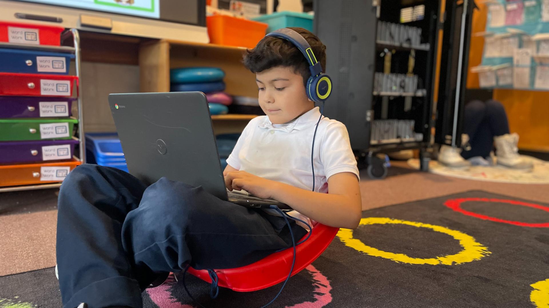
Fr. Nate and I visited a couple of schools in Minneapolis earlier this week. One of the many moments that brought a smile to my face was when Ms. Maher, a first-grade teacher, was announcing the morning’s stations. All four students whose first stop was the technology station gave a silent cheer - one even whispered, “I love Chromebooks!”
Were they cheering for the opportunity to play an online game? Nope, they were cheering to use i-Ready Reading. i-Ready is a program that meets HPL’s Engagement standards for Early Elementary ELA because the instructional content is encouraging, and the user experience is developmentally appropriate for 1st graders.
I looked on as these young learners quickly logged onto their Chromebooks, accessed i-Ready through their Clever portal, and got to work exploring the gamified world laid out for them.
Will those students cheer for the technology station for the rest of their time in first grade? Will exploring the gamified world retain all of its novelty? It is unlikely. But this is to be expected. Even the most elegantly designed educational software can become mundane over time. Think about it: even video games that are made explicitly for fun can become boring over time.
But whether or not adaptive software is fun is the wrong question to ask. Was the process seamless, emotionally engaging, easy to navigate, and developmentally appropriate? Did it F.U.N.? Check and check.
Since 2015, Higher-Powered Learning has empowered Catholic school teachers and leaders to leverage technology and related innovative research-based educational practices to meet the needs of all learners.
Subscribe to the "Higher-Powered Learning News" list to join us in this mission.
If you have any questions about Higher-Powered Learning, please contact our team at hpl@nd.edu.
 Alliance for Catholic Education
